
Content Blocks on the Way to the Core
We have come a long way and there is still a lot to do. Content Blocks are on their way to being integrated with TYPO3 v13 and mark a significant milestone on the development journey and the future handling of building and creating new content elemen…typo3.org
Screenshot Testing
This looks really interesting way to provide UI continuous integration testing.
Like any piece of good software, Piwik comes with a comprehensive QA suite that includes unit and integration tests. The unit tests make sure core components of Piwik work properly. The integration tests make sure Piwik’s tracking and report aggregation and APIs work properly.To complete our QA suite, we’ve recently added a new type of tests: Screenshot tests, that we use to make sure Piwik’s controller and JavaScript code works properly.
Nice simple responsive jQuery Lightbox.
Magnific Popup: Responsive jQuery Lightbox Plugin

Light and open source responsive lightbox plugin with focus on performance, for jQuery and Zepto.js. High-DPI (retina) display support, fast tap for touch devices.
Light and open source responsive lightbox plugin with focus on performance, for jQuery and Zepto.js. High-DPI (retina) display support, fast tap for touch devices.
Tobias likes this.
Rollercoaster
Interesting responsive slider under MIT License.
Rollercoaster was created as a substitude for the Bootstrap Carousel. We needed a Slider wich is able to scroll horizontally and vertically through a set of images and text-content and provides a certain level of remote-controll functionality. As the Bootstrap 2 carousel was using JavaScript to create the transitions, the performance of the first B...
yaml 4.1.x
yaml - YAML (Yet Another Multicolumn Layout) is a modular CSS framework for truly flexible, accessible and responsive websites. It is based on Sass and has a very slim framework core that weights only ~6kB.
Brackets?
When I first read about this http://brackets.io/ it sounded quite interesting. But what is this?
Brackets is an open source code editor for the web. It's built with JavaScript, HTML and CSS by web developers like you.
SORRY!
The current builds of Brackets are only supported on Windows and OSX. We need help bringing Brackets to Linux.
 WTF? Looks like Adobe knows how the web is working.
:headbang #fail
glowing progress bar bulbs
Great progress bar with #CSS3 only. Love these glowing drops.
CSS Loading animation. - CodePen
Ok so this has gone under heavy 'alterations' since I first posted it. Everything is done in HTML/CSS including the controls. The CSS is broken out int...
Haakon Meland Eriksen likes this.
download attribute
For a long time it has been standard practice to ask visitors to "œright click and save as"€ when downloading a file that the browser itself is capable of rendering, but where doing so is not desirable. One reason for doing this is to spare people from the annoying expe...
Google has too much power. Now they can force website operators to create mobile optimized websites.
I think that is good for the user, but it is the totally wrong reason why you should do it.
Smartphone users are a significant and fast growing segment of Internet users, and at Google we want them to experience the full richness of the web. As part of our efforts to improve the mobile web, we published our recommendations and the most common configuration mistakes. Avoiding these mistakes helps your smartphone users engage with your site...
Link Hover Effects with CSS | Web Tutorial Plus
Links are the integral part of internet. The World Wide Web exists because of hyperlinks. So, while designing our websites, it’s important to give high priority to links styling. How do we style our links? I have seen that in many websites, the links are styled with distinct colors and background other than normal text. Surely, the basic design c...
Focal Point
What a nice solution to get the right focal point when cropping images in #RWD. #CSS
GitHub: focal-point

A small set of CSS classnames to help keep images cropped on the focal point for responsive designs. Using only HTML/CSS, web authors can specify an image's focal point, which stays as the imag...
focal-point - A small set of CSS classnames to help keep images cropped on the focal point for responsive designs. Using only HTML/CSS, web authors can specify an image's focal point, which stays as the image's primary focus, while the image's available width changes on responsive webpages. Crop and re-size images depending on available width and let CSS to do all of the work, and without any JavaScript.
An intersting article that shows it in action:
Design Shack: Focal Point: Intelligent Cropping of Responsive Images | Design Shack (Joshua Johnson)
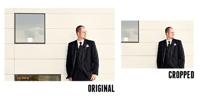
The practice of implementing responsive images is still in its infancy. We’ve seen a lot of ideas and suggestions for how it should be done and we’re bound to see a lot more.
Reading an article entitled Focal Point: Intelligent Cropping of Responsive Images on Design Shack.
Just need to get this into my CMS somehow.
like this
HTML5 download attribute
For a long time it has been standard practice to ask visitors to "right click and save as" when downloading a file that the browser itself is capable of rendering, but where doing so is not desirable. One reason for doing this is to spare people from the annoying expe...
obsolete hgroup
Just eliminated hgroup. Not sure yet about the right alternatives. At least my page validates as valid #HTML5 again.
If you don’t already know, the hgroup element is obsolete in HTML5. Advice is now provided in the HTML spec on how to mark up subheadings, subtitles, alternative titles and taglines using existing and implemented HTML features. The important question for developers is: How do I mark up these buggers??? To answer this advice has been added to the ...
The Cicada Principle and Why It Matters to Web Designers
Very impressive work! Using CSS and prime numbers to generate appealing random patterns.
A few weeks ago we looked at the process of making seamless tiles. As super-​​useful as seamless tiles are, it can be tough to get the balance just right.
Lorem Ipsum Alternatives
I didn't knew there exist so many Lorem Ipsum alternatives.
Du bist auf der Suche nach Fülltext, hast aber keine Lust auf Lorem Ipsum? Ob Bacon oder Veggie Ipsum, wir haben die perfekten Fülltext-Variationen für jeden Webdesigner. Sogar Charly Sheen, Samuel L. Jackson und Barack Obama sind dabei.
OpenWeb Icons font
Why OpenWeb Icons? Because Font Awesome had no RSS-icon and a font with only one icon would be a bit boring...!
Client-side templating
Interesting proposal.
A resource for developers looking to put HTML5 to use today, including information on specific features and when to use them in your apps.
HTML5 offline
Have read often about these new #HTML5 offline features, but saw them really seldom in production.
An offline cache in your browser and a bit of HTML5 acrobatics combine for interactive web applications that keep working even when the Internet connection breaks down.
An interesting interview with Eric Meyer about #CSS.
I had a moment to interview CSS author, developer, and legend Eric Meyer. We talked about the history of CSS, CSS' problems today, and where we go from here.
The answer to the question what mistakes developers most frequently make has some important points. Removing of focus outlines and the end of control over a page layout.
Beyond that, the biggest is probably still that developers think CSS gives them absolute control over page layout and presentation. It doesn't, and was never supposed to: CSS gives you presentational influence, and that's it. Granted, that influence is very strong, but it can still be overridden by users, by devices, by any number of things.
I hope developers know this, but it also seems something that is really hard for customers to understand and accept.
Impressive charts library under MIT license.
Open source HTML5 charts using the canvas tag. Chart.js is an easy way to include animated graphs on your website.
Unbelievable how many polyfills are out there.
So here we're collecting all the shims, fallbacks, and polyfills in order to implant html5 functionality in browsers that don't natively support them.
Bad webdesign wins again
I hate IE for letting me do such things! 🙁
<!--[if lte IE 8]>
<script type="text/javascript">
  $('#fs-2 li:first').css("display", "block");
  $('#fs-2').attr("id", "#fs-badIE8");
</script>
<![endif]-->
Needed for a navigation with a hover submenu over a flexslider slideshow.
But I found much more evil stuffs:
An extensive list of browser specific CSS and JavaScript hacks from all over the interwebs.
Photobox image gallery
I like this #CSS3 and jQuery image gallery.
Photobox - CSS3 image gallery modal viewer
A lightweight CSS3 image gallery that is pretty to look and and easy to use
like this


they claim with CSS3 all the calculations are done on the GPU and not on the CPU for JavaScript. So it should be faster... and maybe it's a parameter issue as you can set a waiting time.
And, you have to backport it from Red to ~friendica 
It is neither working in Opera nor konqueror, too which is also sad I think. But I think it is a really impressive demonstration what you can do with CSS3 and modern browsers. Also it is still under development.
As far as I understand this gallery the JavaScript is only needed to load the images and react to the interactions like back and forth buttons, etc. All the animations are done completely in CSS3. It depends on the browser and also OS which effects are GPU accelerated and it still gets improved.
http://www.chromium.org/developers/design-documents/gpu-accelerated-compositing-in-chrome
https://wiki.mozilla.org/Platform/GFX/HardwareAcceleration
http://blogs.msdn.com/b/ie/archive/2011/04/26/understanding-differences-in-hardware-acceleration-through-paintball.aspx
There are enough accessible, better touch enabled, more responsive, etc. galleries out there to choose. This is just eye-candy and nice to have. It is also no problem to include such gallerie with some kind of feature detection or progressive enhancement.
Furchtbarer Tag
SASS
"Which CSS preprocessor language should I choose?" is a hot topic lately. I've been asked in person several times and an online debate has been popping up every few days it seems. It's nice that the conversation has largely turned from whether or not preprocessing is a good idea to which one language is best.
Impressive animation effects for web #typography.
#CSS3 #webdesign
In today’s tutorial we’ll create another typography effect. The idea is to have some kind of sentence and to rotate a part of it. We’ll be “exchanging†certain words of that sentence using CSS animations. ...
Klaus Weidenbach
in reply to Klaus Weidenbach • •A List Apart: Application Cache is a Douchebag